Portfolio
Work I have produced, edited or art directed. ✭ = award winning
Goldbot: A Facebook Bot for Critic's Picks ✭
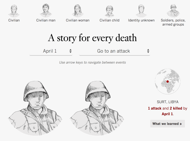
Diary of Terror: A Story for Every Death ✭
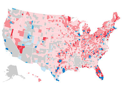
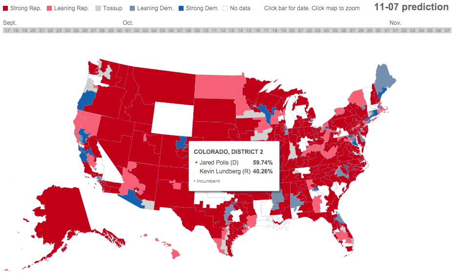
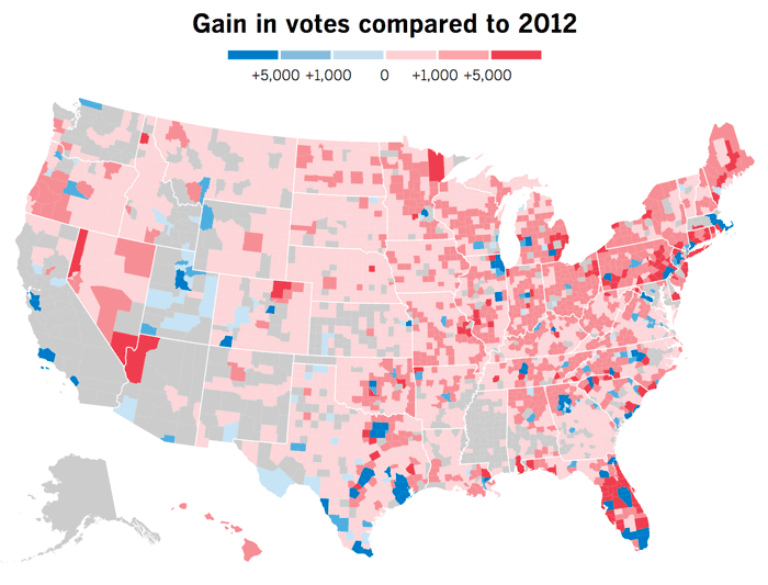
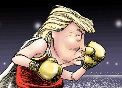
How Donald Trump won the White House ✭
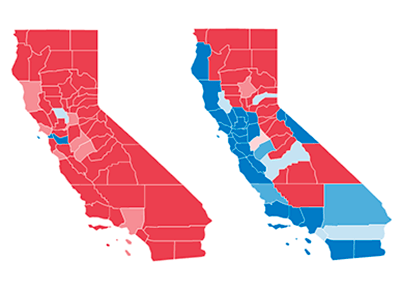
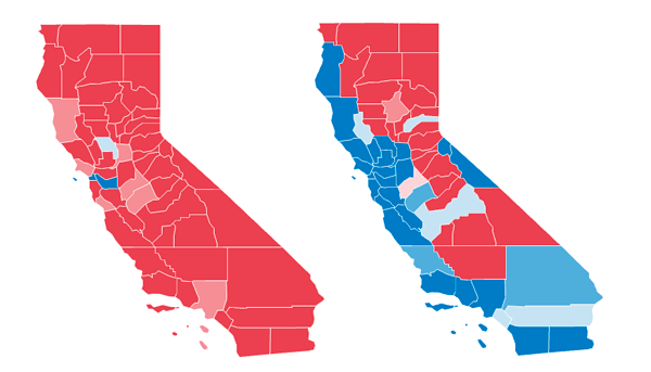
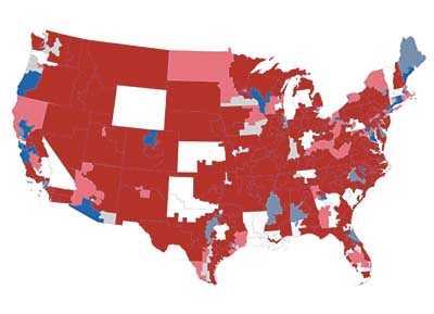
How California Became a Blue State Again ✭
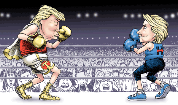
Presidential Debate Scorecards ✭
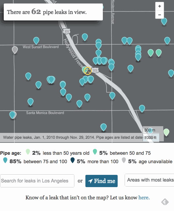
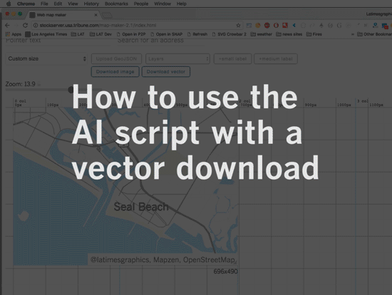
Map Maker: An Open Source Tool for Newsrooms
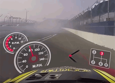
Long Beach Grand Prix Tour in 360°
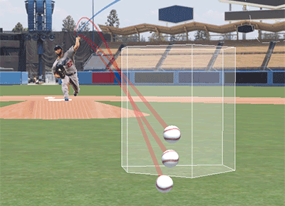
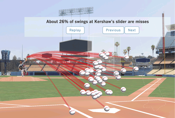
How Clayton Kershaw Dominates ✭
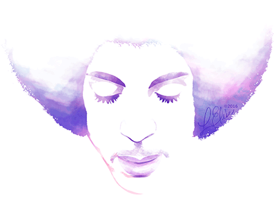
The Artists Prince Ushered into the Spotlight ✭
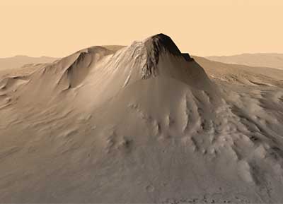
Virtual Reality Tour of Gale Crater ✭
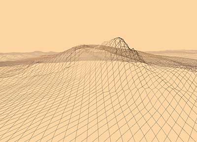
How the Gale Crater VR Tour Was Made
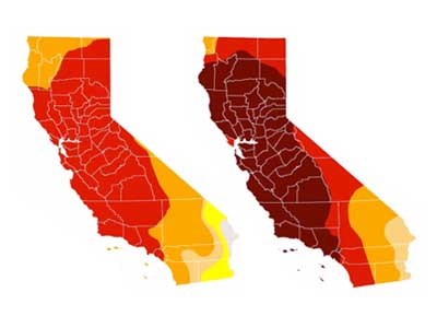
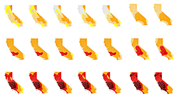
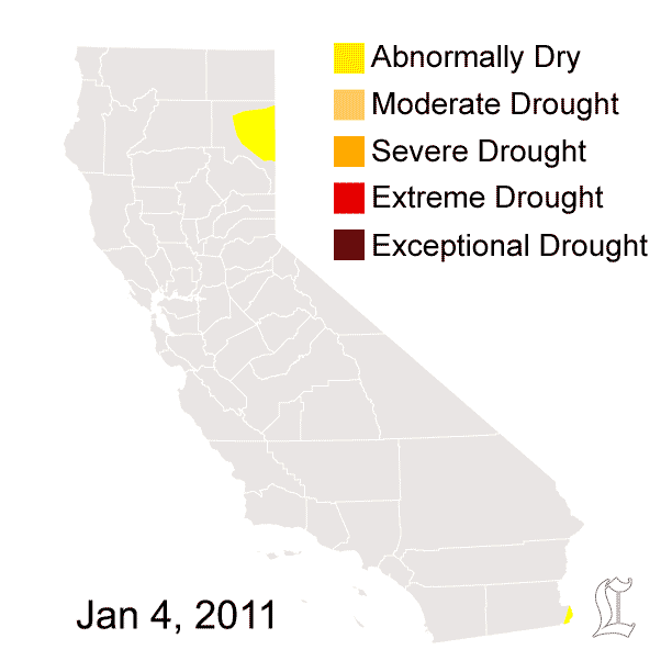
Evolution of the California Drought ✭
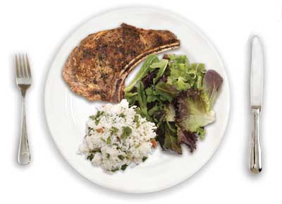
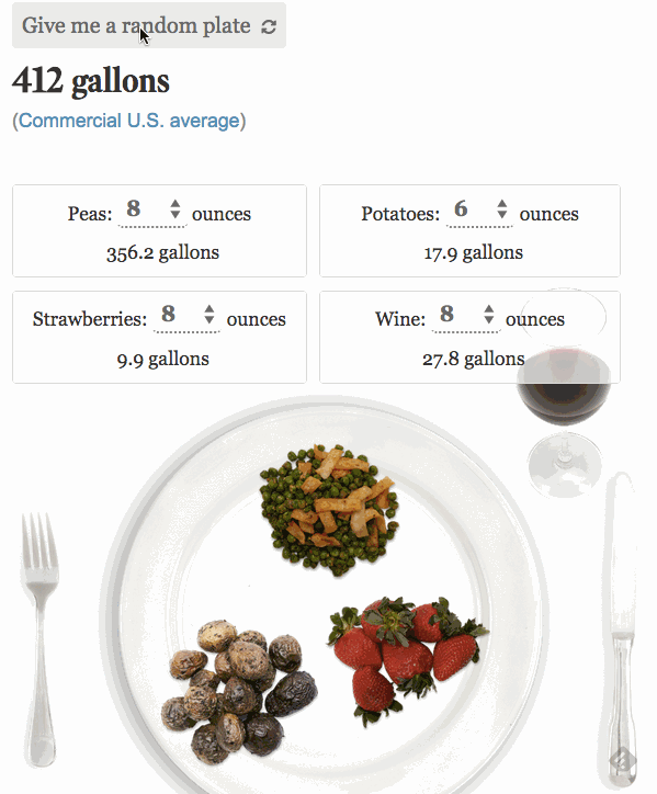
How Much Water Goes into Your Meal ✭
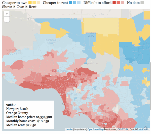
Rent or Own: Where Can You Afford to Live? ✭
Opposing Views in Gardena Police Shooting ✭
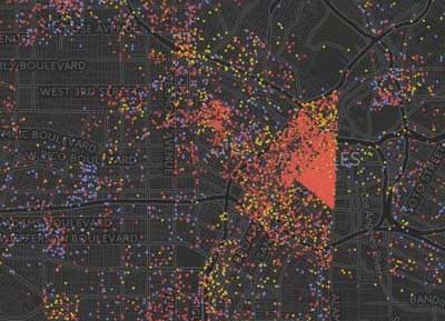
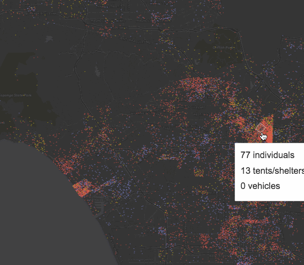
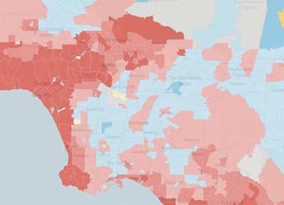
Where Are L.A. County’s Homeless? ✭
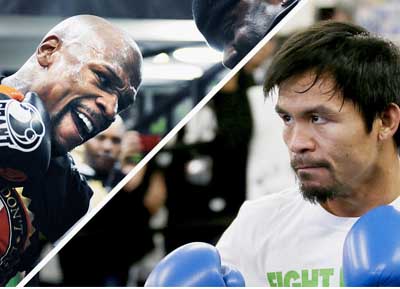
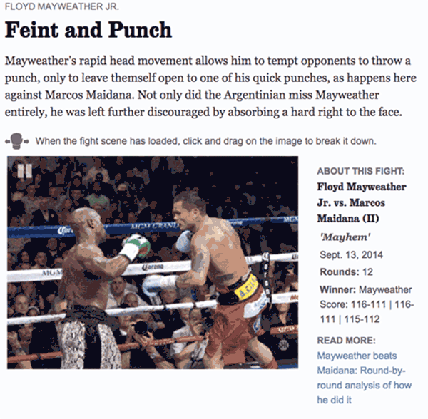
Inside the Fight: Mayweather vs. Pacquiao
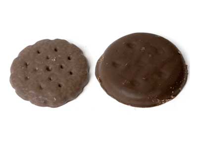
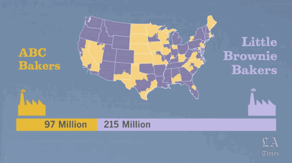
The Girl Scout Cookies You're Not Getting
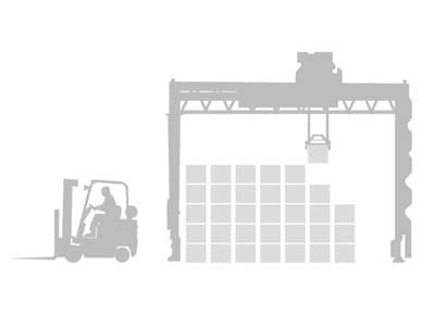
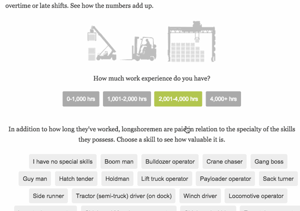
How Much Can a Longshoreman Make? ✭
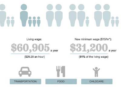
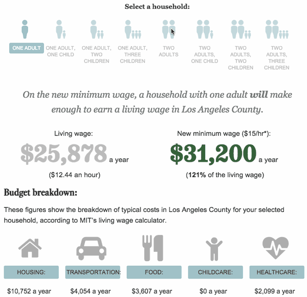
Could You Live on L.A.'s New Minimum Wage? ✭
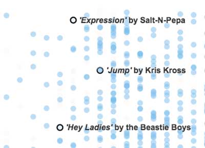
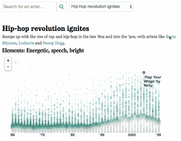
The Evolving Elements of Pop Music
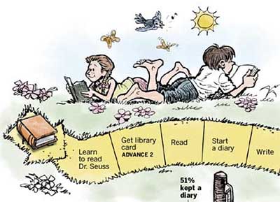
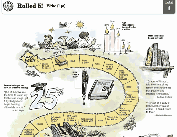
The How to Be a Writer Game ✭
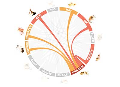
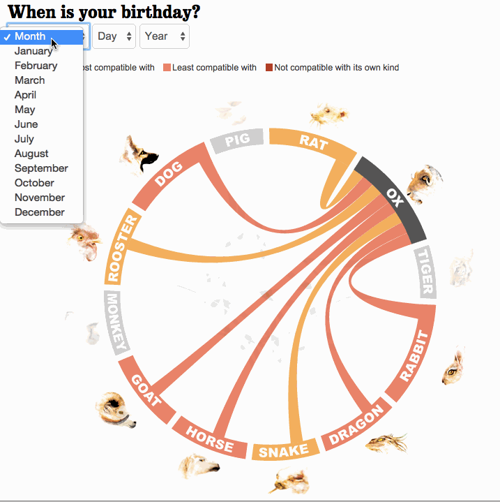
Chinese Zodiac Matchmaking Guide ✭
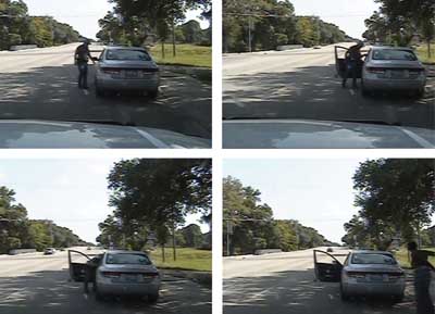
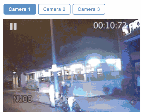
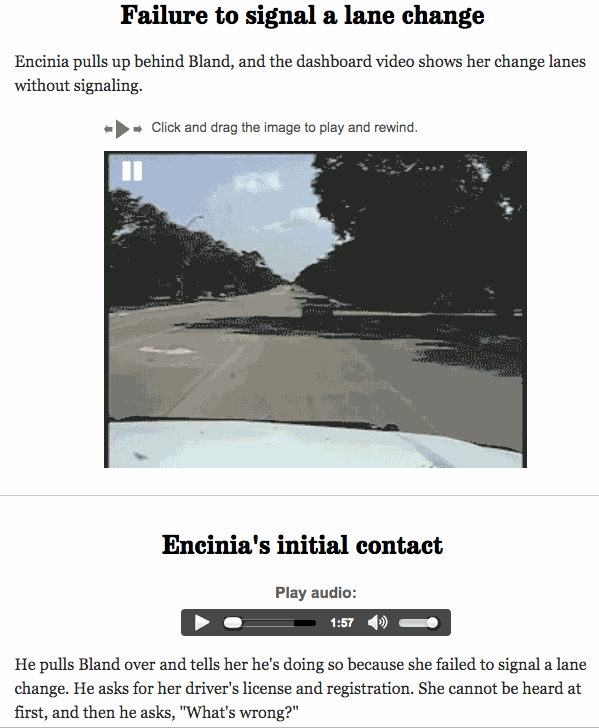
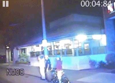
Sandra Bland's Arrest Video: What It Shows
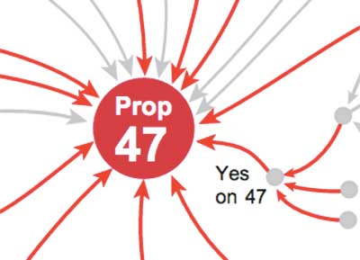
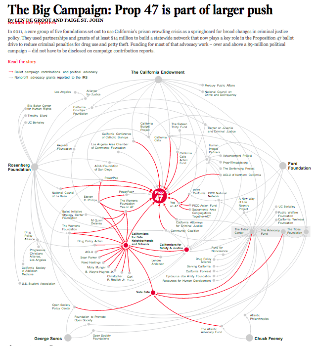
Prop 47 is Part of Larger Push
Voting with Your Tweet Experiment
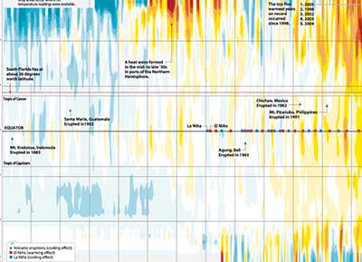
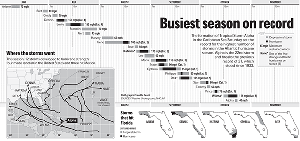
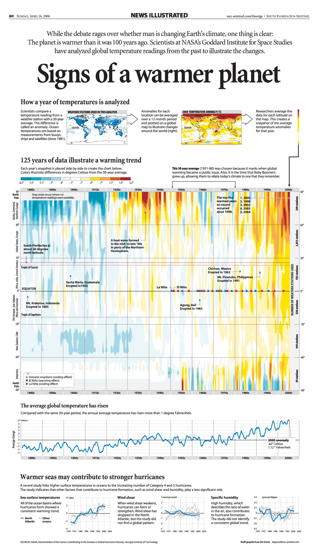
Signs of a Warmer Planet ✭